Webjet Brand Guidelines
Ver. 1.1, March 2026
Welcome to the Webjet brand guidelines. This is your go-to for how we look, speak and show up everywhere. Clear, practical and built for consistency.
Logo
Logomarks
The Webjet logomark is a bold and modern evolution of the brand’s original symbol. It keeps a clear connection to our past while stepping confidently into a more contemporary space. Its simplified, rounded form adds a sense of energy and approachability, reflecting Webjet’s role as a helpful and friendly travel companion. The design is built to be flexible across every digital touchpoint, clean enough for app icons, sharp enough for social media, and instantly recognisable at any size. Whether it appears on a boarding pass, banner ad or booking screen, the logomark delivers clarity and impact without needing to shout.
The Webjet logomark must always face left, nose to tail. This orientation is fixed and should never be flipped or rotated. Maintaining this direction ensures consistency, recognition and alignment with the brand’s design system.


Wordmarks
The Webjet wordmark is a modern update of our original brand name, designed to feel fresh, clear and full of energy. Its geometric structure and balanced letterforms make it feel both confident and approachable, ready for use across everything from websites to mobile apps. While the style nods to our past, the updated form brings a more streamlined and human quality that fits the way people travel today. It’s consistent, recognisable and designed to hold its own in any digital environment, helping Webjet stand out and stay trusted wherever the journey begins.
Designed for digital use, the wordmark maintains clarity at small sizes and scales cleanly across all screen-based applications.


URL Wordmarks
The Webjet URL wordmark is a custom extension of the core brand, created for moments where the web address is the focus. Used in campaigns and digital touchpoints, it pairs the recognisable wordmark with either .com.au or .co.nz to drive clarity and consistency.
This version should only appear when directing users online, maintaining the same care, spacing and visual balance as the primary branding.


Logo Lock-ups
Primary horizontal lock-up
In rare or space-limited cases, when the logomark and wordmark need to be locked up for small digital executions such as mobile headers, app navigation or booking UI components, use a fixed gap equal to half the height of the wordmark as the minimum spacing between them.
While this doesn’t follow the standard clear space rule, it allows for better usability and legibility in compact layouts. The gap can scale proportionally depending on the available space but must never be smaller than half the height of the logomark.
In these instances, the logomark may appear on the right side of the wordmark to preserve its directionality and improve layout efficiency at smaller sizes.


Stacked lock-up
The primary logo lockup is the horizontal version and should always be prioritised. In situations where the horizontal lockup is not suitable for smaller or constrained spaces, such as circular placements, the stacked logo lockup can be used to maximise the available area and maintain legibility.


Logo Clearspace
Clear space around the wordmark and logomark helps maintain its presence and should always be respected. While you can increase this space to suit a layout, never reduce it. Crowding them affects visibility and diminishes its authority.
You can scale up as needed to suit larger formats, but never scale down below the minimum size, as it compromises legibility and weakens brand impact. These minimums are set to ensure the wordmark remains sharp, clear and recognisable across all applications.


Anchoring Exception
Only the Webjet wordmark can be anchored within the layout. It may be grounded or aligned to a side when stronger structure is needed, as long as clear space is maintained on at least two sides. The logomark must remain free within the grid and must not be anchored to any edge.


Scaling the logos
The logomark and wordmark are always used together, but never locked up. They should sit separately in every execution, with matched height to maintain visual balance.
By default, the logomark and wordmark are designed to be equal in height. When the logomark feels too dominant or space is limited, it can be scaled down to align with the height of the “e” in Webjet. This adjustment ensures both elements remain visually harmonious without competing for attention.
In rare or space-limited cases, such as mobile or UI environments, the two elements may be locked up with the logomark positioned on the right side of the wordmark. This helps preserve directionality while maintaining clarity at smaller sizes.
Refer to the layout section of this document for clear usage guidelines, spatial relationships and scaling examples that ensure consistent application across all formats.
1: Logomark height = Wordmark height
2: Logomark height = Wordmark e height

Co-marketing lockup
Aim for a 50/50 visual balance between both (or all) logotypes. To achieve this, horizontally oriented sponsor logos may need to be scaled down. Vertically centre the two logotypes, and ensure the space between them is equal to the height of the “J”. Place a divider line in the centre of this space.


Minimum Size
Our logos are designed to work at all sizes. The minimum logo size is set to a height of 10px, ensuring proper legibility. There is no set maximum size. If you go big, always remember to follow the rules of clearspace.
Logomark minimum height
Digital: 10px
Print: 10mm


Wordmark minimum height
Digital: 10px
Print: 10mm


URL wordmark minimum height
Digital: 10px
Print: 10mm


Logo Placement Examples
While our placement rules allow for flexibility across formats, the Webjet grid system must be used to guide the logomark’s position. This keeps layouts consistent and balanced.
The preferred layout places the logomark in the upper half and the wordmark in the lower half. This structure helps guide the eye, but can be swapped if the composition calls for it.
Wordmark right


Wordmark top right

Wordmark left


Wordmark top left

Logo use on backgrounds
These are the approved colour combinations for pairing the logo with Webjet’s brand colours. Use them consistently to keep the brand clear and cohesive.

Ensure strong contrast when using logos on images. Never place them on backgrounds that clash or blend.


Misuse
Our wordmark and logomark should never be altered, redrawn or added to in any way. Always use the approved assets supplied by the Webjet marketing team to ensure consistency and brand integrity across all applications.

Do not use the old logo

Do not use other colours

Do not tilt or rotate the logos

Do not stretch or squeeze the logos

Do not add logos to busy backgrounds

Do not apply effects such as a drop shadows

Don’t vertically stack the logo

Do not forget clear space
Colours
Colour sets the tone for every journey. It’s how people spot us in a crowded screen, how they remember us after booking and how we build trust along the way.
This palette brings consistency across all destinations, whether digital or physical, so Webjet always feels familiar, clear and easy to navigate.
Primary Colours
Our colour palette takes off with a bold new Red #e24747 designed to stand out in the travel crowd. It’s supported by classic black and white for clarity, with secondary tones and shades to add local flavour. Together, these colours help Webjet feel fresh, familiar and ready for any journey.
Always use the approved colours, including their supplied tints and shades. Don’t create your own variations or introduce new colours outside the palette. This keeps the brand consistent and ensures all elements feel connected across every touchpoint.
Webjet Red
Black
White
Secondary Colours
Reflecting the spirit of travel and the places we explore, our secondary colour palette draws from Australia’s rich and varied landscapes. From coastal blues to inland earth tones and the greens of native flora, It captures the feeling of journeys.
Designed to feel both familiar and fresh, it brings consistency to how Webjet shows up across every trip.
Turquoise Bay
Bondi
Kakadu
Uluru
Pinnacles
Tints and Shades
Use tints and shades to create hierarchy, add contrast or soften layouts where needed. These colours work best in illustration, data, icons or background blocks, always in moderation.
Primary Tints and Shades


Secondary Tints and Shades


Typography
Typography shapes how Webjet speaks. It creates rhythm and clarity, guiding travellers through content with ease across digital and print. From search to checkout, consistent type use brings structure, highlights key info, and keeps the journey smooth. It’s a clear, confident expression of the brand voice.
Font Usage Rules for Futura PT
Futura PT must always be embedded using the Adobe Fonts JavaScript. The licence does not permit self-hosting, so the font must be loaded directly from Adobe. This means Futura PT cannot be used on platforms like Meta or in HTML5 ads, as they do not support third-party font loading or external JavaScript. The font also cannot be used in dynamic out-of-home placements.
Where Futura PT cannot be used, the fallback font is Figtree.
For end frames in TVCs and static OOH, Futura PT should be used. In dynamic OOH, use Figtree unless the asset is supplied as a static JPEG or MP4, in which case Futura PT is acceptable. For Meta and HTML ads, use Figtree. On the website, use Figtree. In emails, use Arial.
Headline font
Futura PT comes in a versatile range of weights, from Light to Black, with matching italics. This flexibility allows for clear hierarchy, contrast and tone across all brand communications. Use lighter weights for supporting copy and heavier weights to emphasise key messages and calls to action.
Futura PT is the designated headline typeface and should be used exclusively for headings and primary emphasis.
Headlines: Futura PT

Typographic exceptions
Letter “j”
The Futura PT “j” lacks the required curvature for the brand. For all primary headings, replace the “j” with the Figtree “j” to maintain visual consistency.
Question Mark “?”
Due to its unique shape, the Futura PT question mark does not align with the brand’s typographic style. Use the Figtree “?” instead.
Reduce the font size by 5 to10 percent to visually match the surrounding characters.
Typographic exceptions

Body & system font
Figtree is a clean, modern sans serif with soft curves that pair naturally with the geometric strength of Futura PT. Its friendly, open shapes make long-form content easy to read, while maintaining a confident tone. As a Google Font, it’s free to use and integrates effortlessly across web, email and print, making it a practical choice for a digital-first brand like Webjet.
Figtree should be used for sub‑headings, body copy and system text.
Body & System: Figtree

Backup system font
Arial is our backup system font, chosen for its wide availability and reliable performance across all platforms. It maintains clarity and consistency when custom fonts aren’t supported, ensuring a seamless brand experience. Use Arial for internal documents, email signatures, system-generated messages and anywhere Futura PT or Figtree can’t be applied.
Backup System: Arial

Text Alignment & Case
We always set our type left-aligned for clarity and structure. Use sentence case by default, with taglines as the only exception.

Never use all caps

Grids & Layout
Our grid system creates structure and flexibility across all layouts. It ensures every element has a place, helping designs feel organised and easy to navigate. Whether you’re building a website, a presentation or a social tile, using the grid keeps everything aligned, balanced and consistent across the Webjet brand.
Cells
The grid is a cell based grid conformed by round corner quadrilaterals (Squares or rectangles).
To ensure maximum consistency in grid creation and rounded corners, each cell is based on a perfectly contained grid of circles

Each cell is separated on all sides by 1/5 or 20% of the radius of a base circle.

Cells within the grid can be joined in flexible ways to create dynamic layouts. You can align them with a visible seam for emphasis or blend them seamlessly into a straight edge. This flexibility allows for playful shifts in hierarchy and helps structure key messages clearly.

Landscape & portrait layout
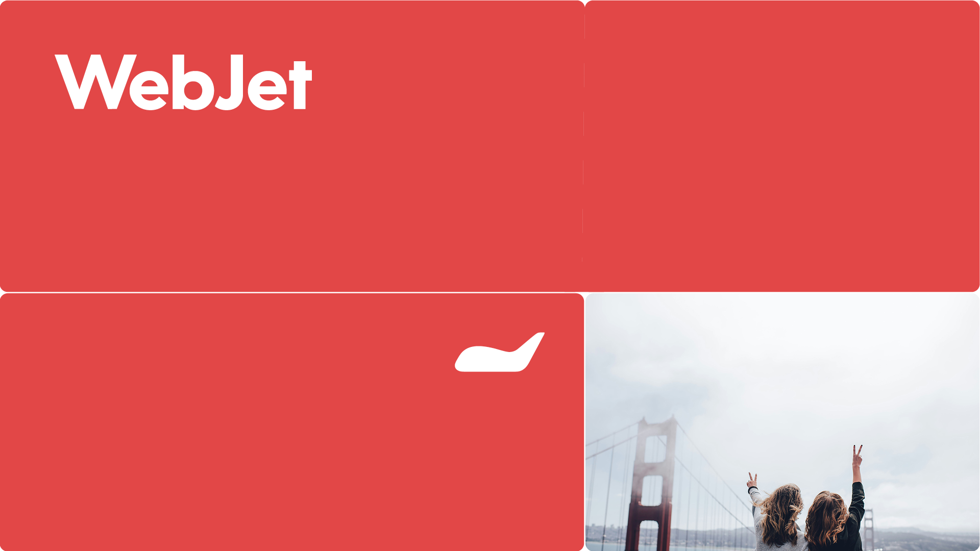
Webjet’s grid system is built on a flexible 6×6 structure. It’s a deliberate choice that nods to the six letters in the Webjet name, creating a visual rhythm that feels uniquely ours. The six columns and six rows form the backbone of our layouts, making it easy to build clean, structured designs with plenty of room to adapt.
We use a bento-inspired approach, allowing content blocks to shift, scale and slot into place depending on the message, platform or format. This gives the system both clarity and creative flexibility. Content can stack, stretch or sit side-by-side without ever feeling messy or forced.
Whether you’re laying out a homepage, an email or a social tile, the grid helps you create balance, maintain alignment and keep everything feeling cohesive. Stick to the structure, and the design will always feel unmistakably Webjet.ithin the grid system to maintain clarity, consistency and visual balance.
Landscape layout
Use up to, but no more than, six divisions within the grid system to maintain clarity, consistency and visual balance.


Landscape - Grid for full bleed


Portrait layout
Use up to, but no more than, six divisions within the grid system to maintain clarity, consistency and visual balance.


Portrait - Grid for full bleed


UI Icons
Font Awesome - Classic Solid
We use Font Awesome Classic Solid icons as the official icon set for the Webjet brand. Their bold, rounded forms echo the modularity and softness of our visual system, complementing the grid-based layout and flexible content blocks across our digital platforms. This consistency in shape and weight creates a more unified brand experience.
Icons must never be custom-designed or modified. Always use the approved set to maintain brand consistency. If you can’t find an icon in the supplied Webjet branding pack, your first stop should be the Travel & Hotel category at www.fontawesome.com/icons/categories/travel-hotel.
If the right icon still isn’t available, contact the Webjet marketing team before creating or sourcing anything new. Using unapproved icons can dilute the brand and disrupt the clarity of our communication. Stick with the system, and it’ll support every journey you design.

Imagery
Photography
Overview
Choose images that feel authentic and unexpected, whether it’s destinations, people or travel moments. Use fresh angles and natural, low contrast tones to create a calm, premium look. Show real experiences, such as wandering laneways, sharing food, and quiet dawn scenes. Capture genuine emotion, wonder, curiosity, delight, rather than posed, postcard clichés or bright, shouty colours. Avoid obvious tourist shots or stock-style smiles, instead focus on intimate details and local life that spark imagination. Above all, every image should invite viewers to picture themselves there, discovering something new, with stories worth sharing.
Destination Images
Do:
Seek unexpected angles: frame landmarks through streets, arches, windows or trees.
Show quieter moments: dawn light, evening haze, local life unfolding naturally.
Use low contrast, soft tones: to create a calm, timeless, premium feel.
Include authentic local details: markets, cafés, hidden laneways, not just famous monuments.
Capture emotion & atmosphere: make viewers imagine being there, not just seeing it.
Don’t:
✖ Use obvious postcard style shots or typical wide, centred landmark photos.
✖ Pick high contrast, over-saturated colours that feel loud and primary.


Human
Do:
Show people genuinely engaged in the moment: eating, exploring, talking, laughing naturally, or relaxing.
Use unexpected angles or partial views: over-the-shoulder, glimpses through doorways, or shots from behind.
Keep tones low contrast: soft, natural light that feels calm and premium.
Capture real emotion: curiosity, joy, wonder, not forced smiles.
Make it relatable: so viewers feel like fellow travellers, not spectators.
Don’t
✖ Use staged, overly posed or cheesy stock-style smiles.
✖ Choose harsh, high contrast or over-saturated images that look like a generic travel photo.
✖ Rely on generic tourist shots where people feel like props.
✖ Show large posed groups all looking at the camera.


Travel Moments
Do:
Capture authentic experiences: people sharing street food, browsing markets, enjoying local music.
Look for small, intimate moments: tying shoelaces on a trail, sipping coffee by a window, kids chasing pigeons in a European town square.
Use unexpected compositions: partial views, shallow depth-of-field, over-the-shoulder shots, scenes half-hidden by doorways or foliage.
Keep tones soft and low contrast: for a calm, premium, less ‘shouty’ feel.
Highlight emotion and anticipation: curiosity, laughter, quiet awe and the joy of discovering something new.
Don’t:
✖ Show obvious, posed or overly perfect scenes
✖ Use bright, high contrast colours that feel brash and primary.
✖ Pick generic scenes with no sense of moment or character.
✖ Overdo landmark backdrops at the expense of real moments.


Stock imagery
Unsplash.com is a great image source for Webjet because its library of free, high-quality photos doesn’t feel like traditional stock. The travel category offers authentic, natural-looking imagery that fits seamlessly into brand storytelling. While many images are free to use with generous licensing, Unsplash+ offers a paid tier with expanded options.
Videography
When it comes to video, aim for emotion and curiosity. Viewers should feel like they’re already travelling, experiencing places, not just watching them. Choose video that feels authentic, immersive and quietly captivating, not slick, over-produced reels with fast edits. Use natural light and soft, low contrast grading to keep the look premium and calm.This is about inspiring people to go somewhere.
Destination Images
Do:
Use natural, soft lighting and low contrast grading for a calm, premium look.
Focus on authentic moments: people exploring, sharing meals, discovering local life.
Seek unexpected angles and intimate details: a hand touching a market stall, feet on cobblestones, glimpses through doorways.
Favour slower motion or higher frame rate shots (slowed down in edit) to create a graceful, immersive feel.
Use gentle camera movement: slow pans, and glides that let moments breathe.
Capture emotion: curiosity, wonder, quiet joy, so viewers feel like they’re already there.
Don’t:
✖ Avoid fast cuts, flashy transitions or hectic editing that feels frenetic.
✖ Don’t use harsh lighting, high contrast or over-saturated colour grades that look loud and primary.
✖ Skip obvious posed or staged scenes; no waving at the camera or forced group cheers.
✖ Avoid generic “highlight reels” that feel like stock tourism videos — aim for real, story-driven moments.
✖ Don’t rush; let shots linger so viewers can soak in the experience.
Illustration
Our illustration style is flat, clean and modern; using 4-5 core brand colours to maintain a distinctive, ownable look. Characters should be created from simple, geometric shapes, with minimal detailing. Think expressive, but not intricate. Faces can use subtle lines or dots for eyes and mouths, avoiding heavy features.
Scenes should echo our photography: showing unexpected angles and perspectives. Illustrate people discovering hidden cafés down narrow streets, or wide open spaces, pausing at lesser-known viewpoints, or weaving through vibrant markets. Compositions should use thoughtful negative space, so visuals feel premium and uncluttered. With people, diversity of ethnicity, gender, size and age is important.
Use brand colour pairings, steering clear of additional primary colours. This will create a sophisticated feel, on brand and avoid the cartoonish look of many vector styles. Instead, let tone shifts be gentle, hinting at depth without sharp gradients.
Include small, playful details where possible that reward a closer look: a cat curled on a doorstep, or laundry strung above an alley, a delightful cocktail umbrella in an aperol spritz. These touches add humanity and charm.
Above all, illustrations should evoke a sense of exploration and authentic travel moments, not generic landmarks. This is about telling a story, inviting people to imagine their next adventure with Webjet, and asking them to 'go somewhere' in a way that’s warm, approachable and elegantly simple.

Animation
This animation approach brings our modular grid system to life through smooth, tile-based transitions that feel deliberate and intuitive. Each block and piece of type enters with purpose, mimicking the flow of travel planning in clear, simple steps. The motion reinforces our grid’s structure while adding personality and ease, making the layout feel both organised and human.

Tone of Voice
As your go-to travel companion, Webjet will always have something helpful to say—whether you’re thinking about traveling or in the middle of a journey.
But then there’s how we say it. Just as important as any design or photography, tone of voice is what helps Webjet consistently feels like Webjet. The audience knows it’s coming from the same brand, no matter if it’s a retail social asset or a longer EDM. Our tone of voice reflects and marries with our visual brand, to create a persona that’s differentiated from our competitors and appealing to new audiences.

We are:
Friendly:
A travel companion is a mate. Let’s treat our customers as we’d like them to treat us.
Clear:
Like getting directions to the nearest cafe our audience wants to know exactly what we’re saying.
Aussie/Kiwi:
Disarming and self-aware like the Australians and Kiwis we’re talking to, and talking about travel through an Aussie/Kiwi cultural lens.
Joyful:
Even planning travel for work can be joyful. Without being too Pollyanna about it, let’s bring that joy to the surface when we can.
Conversational:
Even in writing, we’re talking. Read it out when you’re writing it, and if it sounds like it comes from a friendly, clear, Aussie/Kiwi joyful person, you’ve nailed it.
Who should we sound like:

What do we mean by ‘Australian’?
When you’re trying to show your Aussieness to an international audience: maybe you lean on some of our cultural truths and cliches to be completely unambiguous. There might even be a role to play for an ‘Ocker’ tone of voice.
But Webjet is about being Aussie to an Aussie audience.
That means authentically talking and sounding like they do.
Not a stereotype, not a cliché, but a normal Australian.
It’s as much in what we say as how we say it.
Relating to the world with the same self-deprecating, not-too-serious attitude we all pride ourselves on.
A quick word on humour.
Aussies and Kiwis love a joke. But we’re not a ‘one-liner’ kind of culture.
Our humour stems from being self-deprecating and generally not taking things (or ourselves) too seriously.
What’s more, Aussies and Kiwis don’t go overboard;
We never force a joke, and we know when it’s appropriate.
A little bit of humour goes a long way. A lot of humour turns people off.
So when you’re thinking about adding a little smile or a wink to something, just ask yourself,
is this an Aussie/Kiwi thing to do?
How we use ‘Go somewhere’:
In a sentence in longer (EDM or post) copy:
Sentence case.
“We’ve got everything you need to go somewhere”.
As a tagline:
Initial caps.
“Webjet. Go Somewhere.”
As part of a headline:
Sentence case.
“Everyone’s got a good reason to go somewhere”.
Our tone of voice in a chart

Example One: Social Post
Before:

After:
Looking for somewhere to go? Can’t go wrong with these eyeball-melting stunners, especially with our Paypal in 4 limited offer (slide to the last post to reveal the deal). Now that’s how you #gosomewhere 🌍✈️*PayPal Pay in 4 is available for eligible purchases up to $2,000 and is subject to eligibility, terms, and conditions.
Example Two: Website Copy
Before:

After:
Cosmopolitan charm. Cute laneways. History, culture, amazing food,...Melbourne has enough iconic experiences and attractions for dozens of great holidays. Maybe book a show at the Arts Centre in November, or come down for the iconic Boxing Day cricket test at the MCG. The cooler months of May to September are great for quiet getaways—snuggle up by the open fire in one of the many great boutique hotels, and do the galleries and other parts of Melbourne’s ‘great indoors.’
Whether you’re looking for Melbourne accommodation with parking, hotels on a budget or hotels for a special trip, you’ll find everything here to go somewhere.
Example Two: EDM
Before:

After:
Hi Phoebe,
Feel like everyone you know is lapping up the culture and landscape of Japan? Well here’s a deal that makes it even more attractive to go somewhere.
It could be ramen. It could be onsen. It could be the modern noise of Shibuya or the historical quiet of a temple in Kyoto—Japan’s got something incredible for every season and everyone. And we’ve got plenty of options to help you create the ultimate envy-inducing Japanese getaway of your Instagram dreams.
Plus, you can unlock up to 20% OFF* stays after making a flight booking, thanks to Bundle & Save. Book now before these deals end.
Core Musical Personality
Webjet’s sound should feel like departure day, that spark of excitement when you zip up the suitcase, lock the door, and the adventure begins.
Overall tonality:
- Upbeat, energetic, optimistic
- Light, bright, rhythm-forward
- Global in influence without feeling cliché or stereotypical
- Modern production with organic flourishes
Avoid
✖ Heavy rock, metal, grunge
✖ Pure hip-hop/trap
✖ Country or folk ballads
✖ Dramatic orchestral
✖ Retro funk unless modernised
✖ Feeling like stock “corporate inspirational music”
✖ Feeling like an airline safety video
✖ Lean too heavily on national clichés (e.g., mariachi horns, didgeridoo, sitar solos)
✖ Sound depressing, minor-key heavy, or nostalgic in a sad way
✖ Have dark, heavy bass or trap influence
Applications
Regularly updated with relevant and current brand examples.


For any questions regarding Webjet brand
playbook, please contact lana.darcy@webjet.com.au
Copyright © 2001 - 2025